World Cup 2026 Kit Ranking: Which Teams Will Look Best This Summer?
There are 48 teams at the 2026 FIFA World Cup. There are 100+ kits between them — home, away, and alternate strips across every confederation. Most will be forgotten by August. A few will be iconic for decades. And at least half a dozen will require a formal apology from the national football association responsible.
This is the definitive kit ranking.
![]()
Why Kits Matter at a World Cup
Before we rank, let us establish something: football kits matter. Not in the abstract way that people say things matter, but in the concrete, commercial, culturally resonant way that only a garment worn by 11 people simultaneously in front of a billion viewers can matter.
The best World Cup kits sell millions. They become part of a nation’s visual identity. The 1970 Brazil shirt, the 1990 Italy away, the 1994 USA denim-disaster — all burned into the cultural memory of the game. At the 2026 World Cup, thirteen kit manufacturers produced designs for 48 nations across more than 100 separate jerseys. The result is the most varied, most colourful, and frankly most debated kit landscape in the tournament’s history.
We have ranked the field into five tiers: Masterworks, Excellent, Good, Passable, and Crimes Against Football. In the spirit of equity, we have covered both home and away kits where they differ significantly. We have opinions. They are correct.
THE MASTERWORKS — Tier 1: Perfect 10
Argentina Away (Adidas) — The Best Kit at the 2026 World Cup
This is not a close contest. Argentina’s away kit for 2026 is, without qualification, the finest football jersey in the tournament.
The design draws from Fileteado — the traditional Buenos Aires art form typically found on signs, posters, and even taxis in the Argentine capital. Characterised by stylised, symmetrical lines, flowing foliage patterns, and intricate curving forms, Fileteado is one of Argentina’s most distinctly local cultural visual languages. Adidas has taken that tradition and applied it to a football shirt in swirling blue and white patterns that sit on the jersey with the quality of genuine graphic art.
It is the only kit at this World Cup that you could hang on a wall and people would call it beautiful regardless of their relationship to football. It is culturally specific, technically excellent, and visually unlike any other shirt in the tournament. A masterpiece.
Designer: Adidas | Rating: 10/10
Argentina Home (Adidas) — The Classic Elevated
If the away is an artwork, the home is a statement: traditional blue and white vertical stripes, refined with the finest fabric Adidas has produced for a World Cup shirt, and worn by the defending champions. The stripes are clean, the crest is correct, the fit is modern without being theatrical. Sometimes the classics earn their status.
Designer: Adidas | Rating: 9.5/10
Senegal Home (Puma) — Africa’s Most Beautiful Shirt
Inspired by the hand-painted buses of Dakar — the cars rapides that fill Senegal’s capital with colour and movement — the Senegal home shirt is an abstract print that covers the jersey in layers of vivid pattern. It is eye-catching in a way that reads as culturally authentic rather than commercially contrived. The lions of Teranga will look extraordinary in this shirt. A genuine statement kit from a nation developing its design identity at pace.
Designer: Puma | Rating: 9/10
Algeria Away (Adidas) — Understated Class
The Adidas Originals Trefoil has returned to the Algeria away jersey, delivering an unmistakably retro aesthetic that has been universally praised since the kit’s release. Shadow stripes in a deeper shade of green overlay the fabric; the sleeves carry a darker tone that creates depth; a red trim pops against the green base. Everything about this shirt is controlled. Nothing is overdone. Algeria’s away kit is the best understated kit at the 2026 World Cup.
Designer: Adidas | Rating: 9/10
Julián Álvarez FIFA World Cup 2026: Argentina’s Spider Returns to Defend the Trophy | StrikerReport
EXCELLENT — Tier 2: Tournament Quality
USA Home (Nike) — A 1994 Love Letter, Executed Well
After years of USMNT kit frustrations — and after the players themselves demanded involvement in the design process for 2026 — the United States home jersey is a significant improvement on recent editions. The wavy horizontal stripes are a direct reference to the iconic 1994 World Cup jersey, the tournament the US last hosted, recreated with more contemporary flair. The players had input. It shows.
The away — featuring a star design on white — is decent but not exciting. The home is the story here, and it is a good one.
Designer: Nike | Rating: 8.5/10
South Korea Home (Nike) — The Tiger Hidden in Plain Sight
This is the cleverest design in the tournament. South Korea’s 2026 home kit uses a subtle tonal camouflage pattern in the jersey’s fabric to conceal a white tiger — the sacred animal of Korean cultural heritage representing the team’s resilience, unity, and attacking power. From a distance, it reads as a clean blue-white shirt. Up close, the tiger reveals itself. It rewards scrutiny in a way that almost no football shirt does.
Designer: Nike | Rating: 8.5/10
DR Congo Home (Adidas) — Sky Blue With a Conscience
The sky blue home jersey features a central band of zebra skin — a reference to the natural heritage of the DRC. The Leopards’ nickname makes the zebra choice slightly incongruous, but the visual result is genuinely lovely — a soft, distinctive print that elevates a standard sky-blue shirt into something worth wearing away from the stadium.
Designer: Adidas | Rating: 8/10
Japan Home (Adidas) — Retro Precision
Fans who love a clean, retro-style look with a modern twist will love Japan’s 2026 Adidas jersey. The home kit comes in Japanese blue with traditional three-stripe Adidas sleeves and a wave-esque front pattern. The away kit, featuring a pinstripe pattern reminiscent of a classic baseball jersey, is equally strong — fitting for a nation that has become one of the great baseball powerhouses alongside its football rise.
Designer: Adidas | Rating: 8/10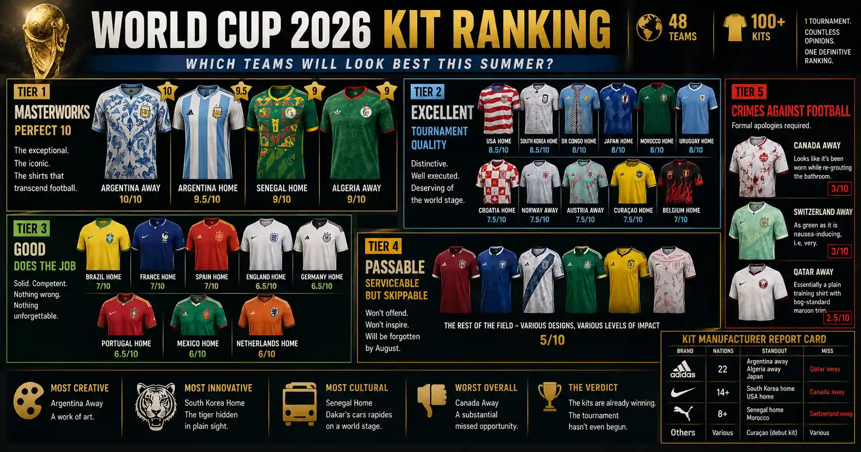
Morocco Home (Puma) — Green with Geometrical Ambition
Morocco’s home shirt channels traditional Moroccan geometric patterns — the kind found in the tilework of the country’s historic medinas — through a modern football lens. The dark green base is unusual among African football nations and gives the defending semi-finalists a distinctive visual identity that matches their reputation for organisation and defensive solidity.
Designer: Puma | Rating: 8/10
Achraf Hakimi FIFA World Cup 2026: Profile, Stats & Career | StrikerReport
Uruguay Home (Nike) — The Celeste That Time Built
Soaked in Celeste blue with a collar and gold accents — a nod to Uruguay’s two World Cup titles in 1930 and 1950 — the 2026 Uruguay home strip would not be entirely out of place in photographs from either of those championship years. It is a studied piece of nostalgia that respects the jersey’s own history. In an era of over-designed shirts, this one earns its simplicity.
Designer: Nike | Rating: 8/10
Croatia Home (Nike) — The Checks That Never Age
Croatia continues to put distinctive spins on its iconic red-and-white checkerboard kit. The 2026 home edition is a solid addition to its catalogue — the checks are crisper, the red more vivid, the silhouette more modern. The blue away provides aesthetic contrast for those who find the checkers overwhelming. Not revolutionary, but consistently excellent.
Designer: Nike | Rating: 7.5/10
Norway Away (Adidas) — The Blizzard
Norway’s full-on whiteout third alternate kit — pristine white with flecks of platinum trim — is described as a blizzard from the tundra. It is Nordic minimalism at its most effective: clean, cold, and visually striking in its simplicity. Simple enough to be timeless.
Designer: Adidas | Rating: 7.5/10
Erling Haaland — FIFA World Cup 2026 Profile, Stats & Career
Austria Away (Adidas) — Controlled Chaos
Austria’s away kit has been the tournament’s most discussed design since its release. A minty green marble effect, laced with hyper-saturated pink and purple veins, then overlaid with a geometric golden arch pattern inspired by the ornate tables of traditional Viennese coffeehouses. There is a lot going on. It has been growing on observers since release. It is either a masterpiece of layered cultural reference or an experiment that went too far. The fact that we are still debating it six weeks after release means it is doing something right.
Designer: Adidas | Rating: 7.5/10
Curaçao Home — World Cup Debut, Arrived in Style
One of the most pleasing kit choices for a World Cup debut. The lemon-yellow tone is vibrant without being aggressive; the coloured stripes through the shoulders add distinction. For a nation making its first-ever World Cup appearance, Curaçao has arrived looking like they belong.
Designer: Unknown/New Balance | Rating: 7.5/10
Belgium Home (Adidas) — Infernal but Familiar
Red, black, and yellow with a flame theme — as Fox Sports noted, this is “the fifth successive home kit with a flame theme” from the Red Devils. It is decent. It is coherent. It will look entirely correct on Romelu Lukaku and De Bruyne. It is also completely predictable. Belgium’s design team has found a formula and is not leaving it.
Designer: Adidas | Rating: 7/10
Brazil Home (Nike) — Canonical Yellow
Brazil’s canary yellow is a football staple. It is the colour of the World Cup’s most storied dynasty. The 2026 version is clean and true to tradition. It cannot be a bad kit — the identity is too strong — but it is not a particularly interesting one either. The yellow is timeless. The design around it is safe.
Designer: Nike | Rating: 7/10
France Home (Nike) — Power Dressing
France’s dark navy home strip projects authority rather than creativity. The Les Bleus’ identity is built on performance, not aesthetics, and the 2026 kit reflects that. Clean, dark, authoritative. It will look correct on Mbappé and Yamal’s opponents. It will not be remembered as a design landmark.
Designer: Nike | Rating: 7/10
Spain Home (Adidas) — Red Is Their Colour and They Know It
Spain in red is one of football’s non-negotiable visual statements. The 2026 home kit delivers exactly what it needs to: the red is deep and correct, the gold trim references the national flag, and the overall result is a jersey that announces “World Cup contender” before a ball is kicked. The away reportedly lacks the home’s conviction.
Designer: Adidas | Rating: 7/10
Gavi FIFA World Cup 2026: How Barcelona’s Wonderkid Became the Heart of Spain
GOOD — Tier 3: Does the Job
England Home (Nike) — Clean, Minimal, Forgettable White. Three Lions. St George’s Cross detail. England’s home kit is exactly what it always is: an excellent surface on which the team either justifies or embarrasses itself, depending on the tournament. Rating: 6.5/10.
Germany Home (Adidas) — The Classic White Returns Germany have cycled back to their classic white with black detail after recent experimentation. Traditional, well-fitted, strong on identity. Not exciting. Reliably correct. Rating: 6.5/10.Group E FIFA World Cup 2026: Germany, Côte d’Ivoire, Ecuador, Curaçao
Portugal Home (Nike) — The Dark Red Standard Deep burgundy-red with green accents. Clean. Strong identity. The crest is excellent. Nothing more required when you have Cristiano Ronaldo and Rafael Leão wearing it. Rating: 6.5/10.
Mexico Home (Adidas) — Host Nation Green The co-host’s home kit is a deep green — the correct green — with gold and red accents referencing the national flag. The away is reportedly less successful. The home does its job with dignity. Rating: 6/10.
Liga MX Guide 2026: The Passion, Money and Talent Behind Mexico’s Biggest Sporting Obsession
Netherlands Home (Nike) — Orange Is Orange Netherlands in orange is football law. The design around that orange is standard 2026 Nike fare. Entirely correct, completely unremarkable. Rating: 6/10.
CRIMES AGAINST FOOTBALL — Tier 5: Formal Apologies Required
Canada Away (Nike) — The Bathroom Re-Grout ESPN’s assessment — that Canada’s away shirt “looks like it’s been worn while re-grouting the bathroom” — is not unfair. The splattered, mottled pattern in off-red on white is intended to be bold. It reads as industrial accident. For a co-host nation with a genuine footballing story to tell in 2026, this is a significant missed opportunity. Rating: 3/10
Switzerland Away (Puma) — The Green Problem Switzerland’s away jersey is, as ESPN noted, “as green as it is nausea-inducing — i.e., very.” The Swiss have produced genuinely creative kits in recent years — Alpine railway stations, digital passports, beautiful concept work. This is none of those things. It is a very green shirt with standard trim and it will bother everyone who looks directly at it. Rating: 3/10
Qatar Away (Adidas) — The Trefoil Cannot Save Everything Even the Adidas Originals Trefoil cannot rescue what ESPN correctly identified as “essentially a plain white training shirt with bog-standard maroon trim.” The Arabic name for Qatar is printed on the back of the neck — that is literally the only design element of note. For a nation that spent $200 billion on the 2022 World Cup, the shirt budget appears to have not followed. Rating: 2.5/10
The Kit Manufacturer Report Card
| Brand | Nations | Standout | Miss |
|---|---|---|---|
| Adidas | 22 | Argentina away, Algeria away, Japan | Qatar away |
| Nike | 14+ | South Korea home, USA home | Canada away |
| Puma | 8+ | Senegal home, Morocco | Switzerland away |
| Others | Various | Curaçao (debut kit) | Various |
Adidas and Nike have alternated outfitting World Cup champions across each of the last four tournaments — Adidas winning in 2014 and 2022, Nike in 2010 and 2018. Whoever wins in 2026 will break the pattern.
The Final Verdict
The 2026 World Cup kit landscape is the most diverse in tournament history — 13 manufacturers, 48 nations, 100+ jerseys, and the widest design range ever attempted at a single event. At the top end, Argentina’s away kit is the finest World Cup shirt in at least a decade. South Korea’s hidden tiger is the cleverest. Senegal’s bus-inspired home is the most culturally rich. At the bottom, Canada’s away and Switzerland’s green are avoidable disasters.
The tournament has not yet kicked off. The kits are already in conversation. That, in itself, is the point.